WELCOME TO MIELE’S
SPACE ODYSSEY
Miele Lab, Hong Kong
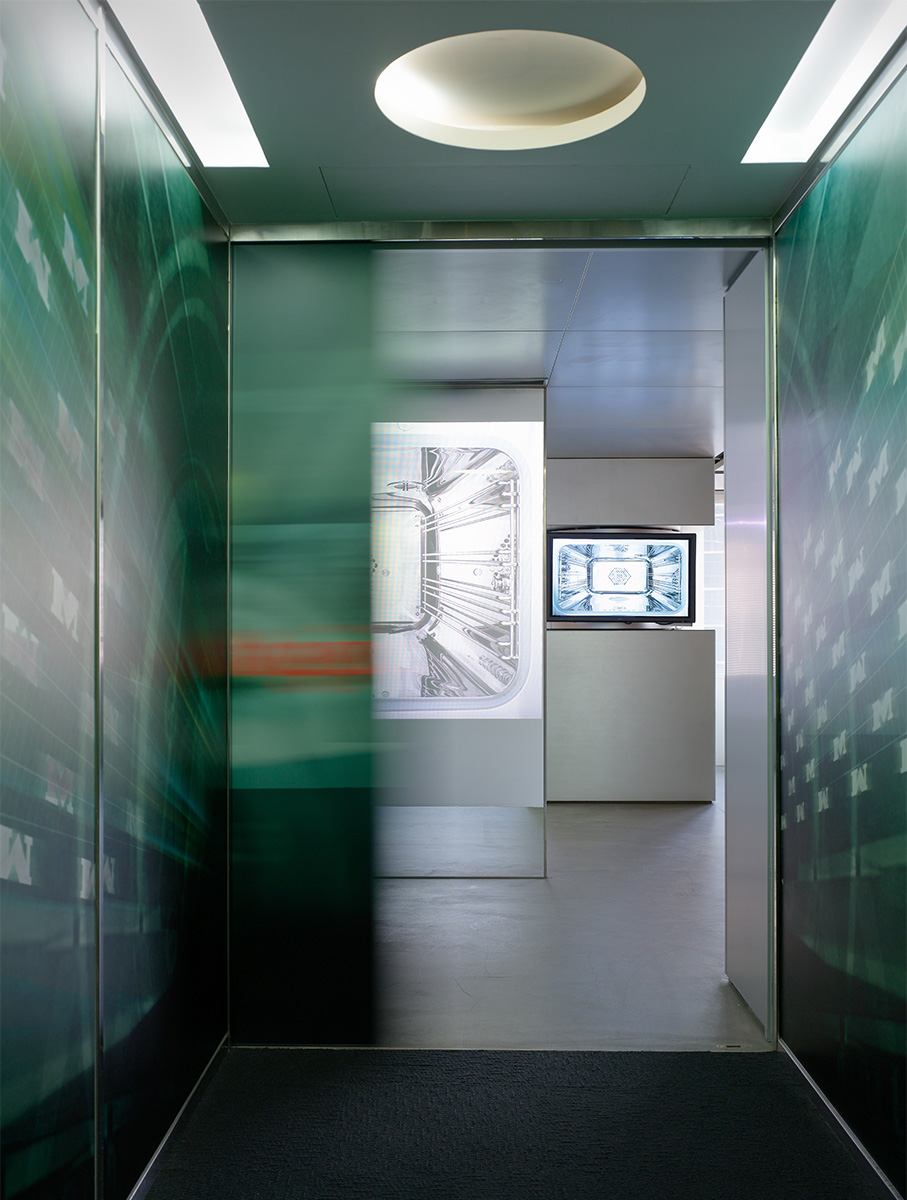
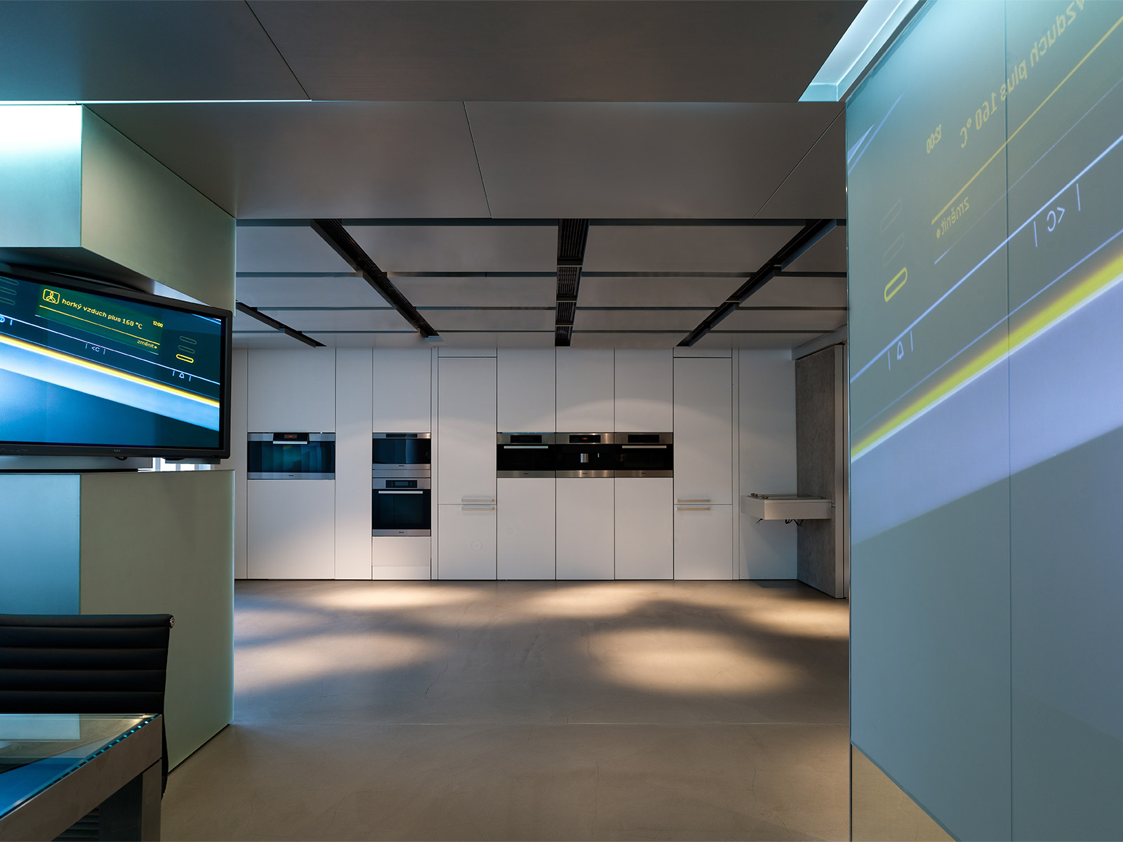
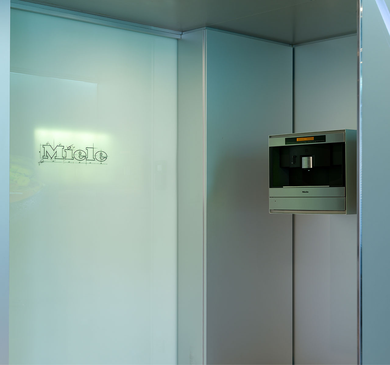
The design of the Miele Lab in Hong Kong has created marketing spaces whose cool futuristic vibe dovetails with the company’s technically advanced domestic products. Large-scale imagery at precisely positioned visual focal-points draws visitors in, defining the different areas of the Lab. Visitors experience this even before they enter the Lab – the entrance door and the glass walls of the approach corridor carry projected images of Miele products in use.
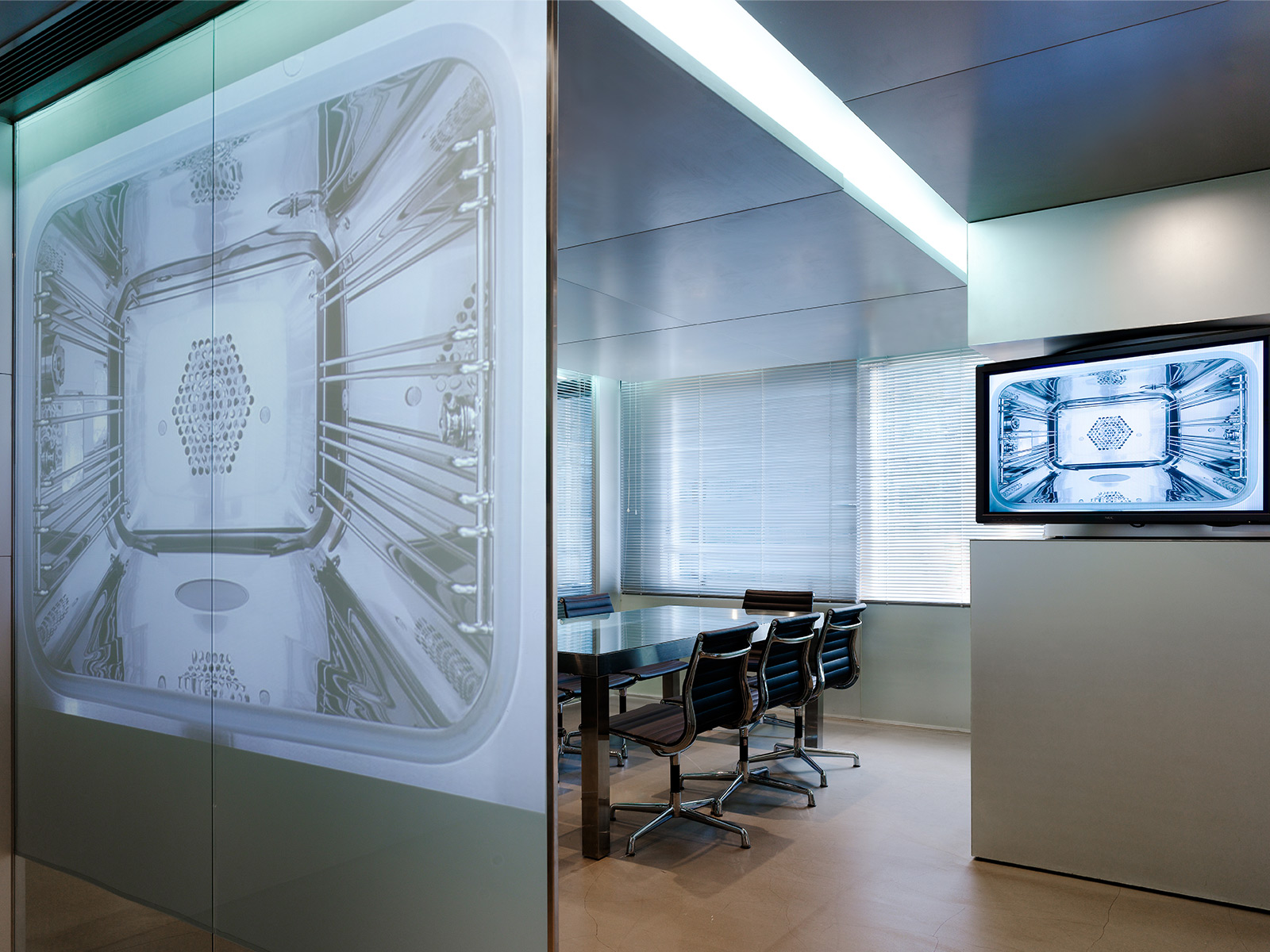
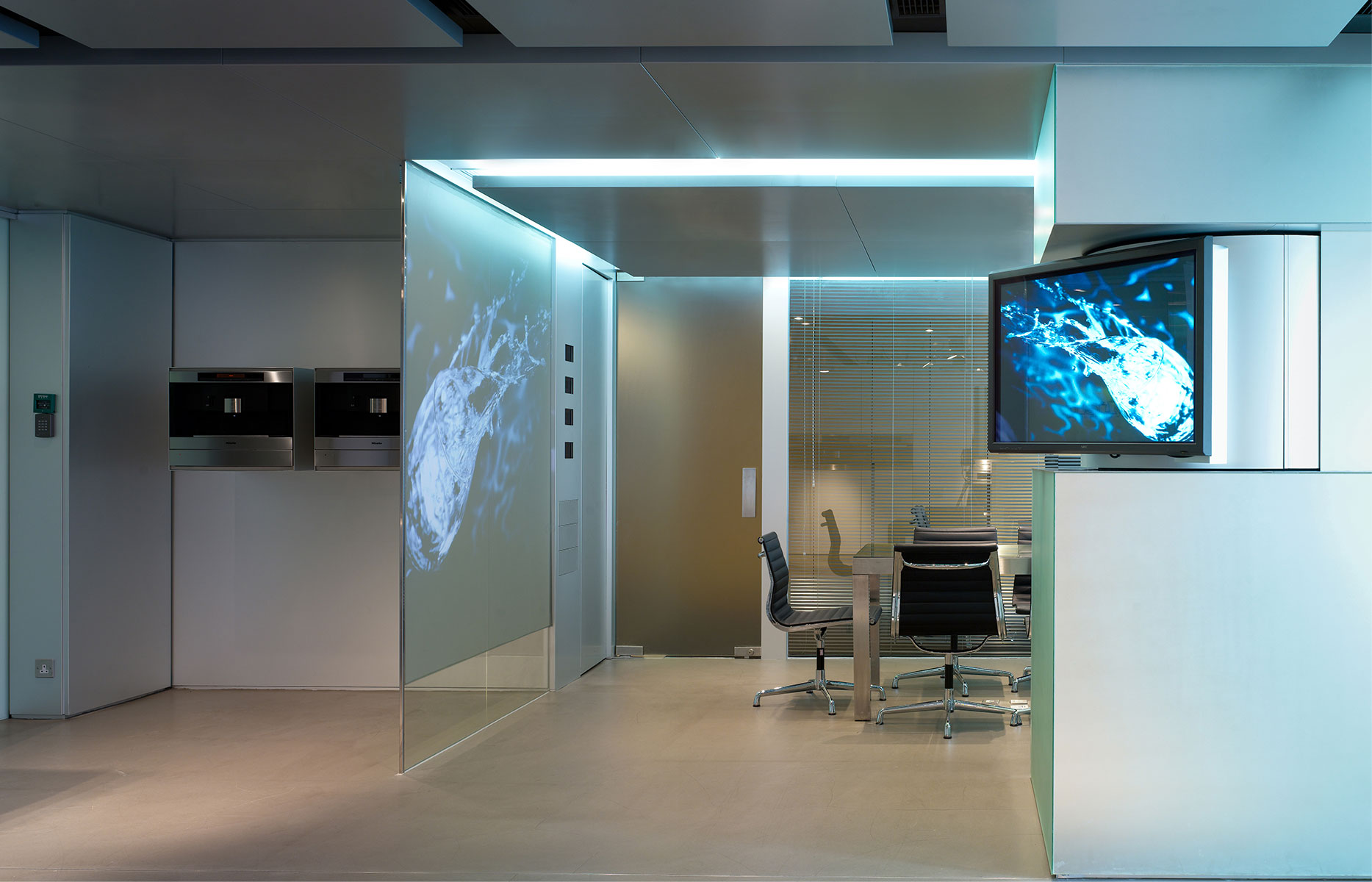
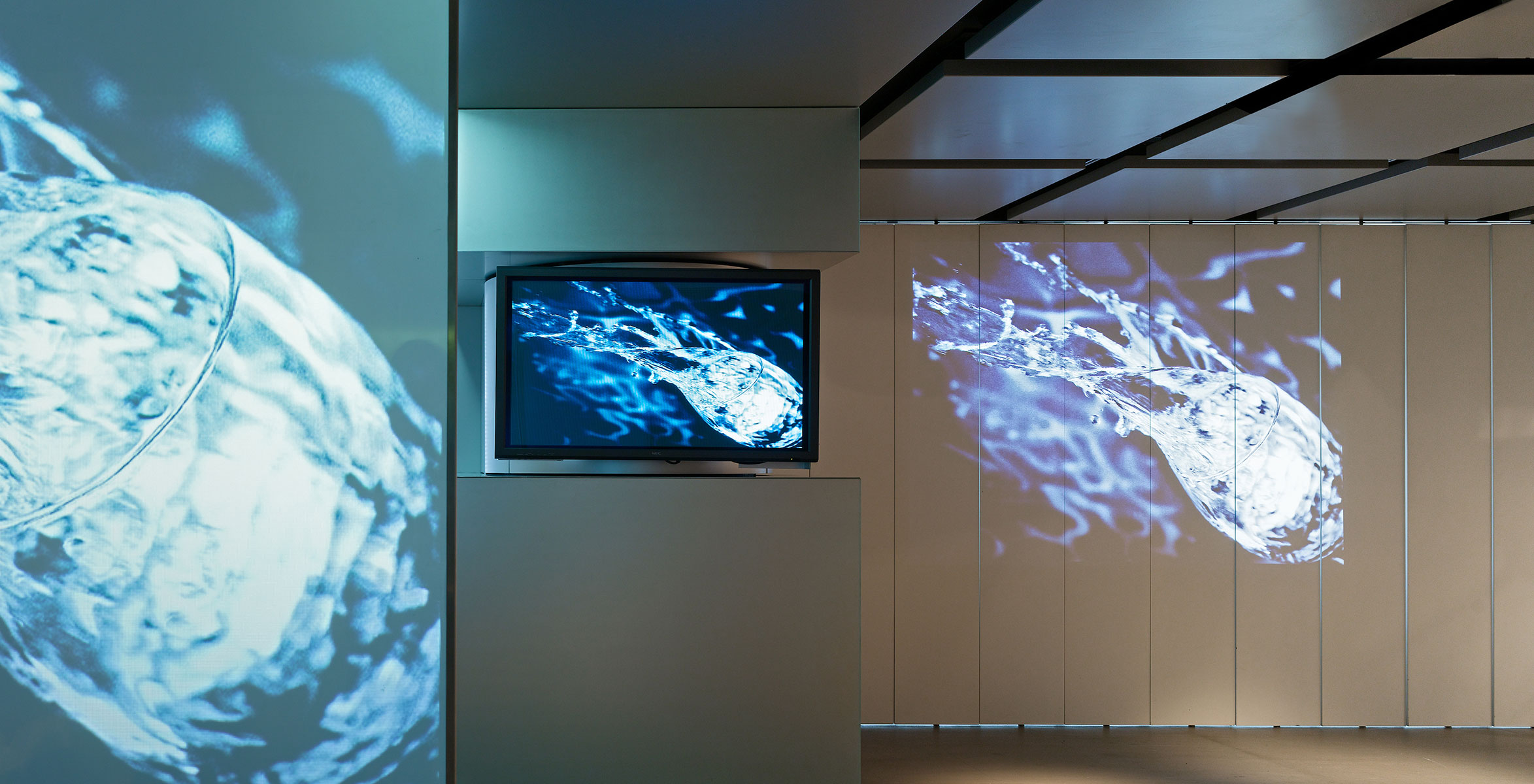
Working with Miele, Antony Chan selected imagery ranging from close-ups of engineering details to cooking and dramatic water vortexes to project onto the glass wall that demarcates the conference room, and onto wooden louvres along one wall of the Lab. The light-spill from the images is reflected softly from the polished concrete floor and the grid of aluminium ceiling panels. And this means that clients, who are often developers of upscale apartment and housing projects, can appreciate products and advice in an environment that is stimulating and calmly informative rather than hard-sell.
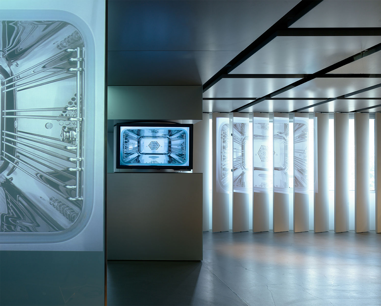
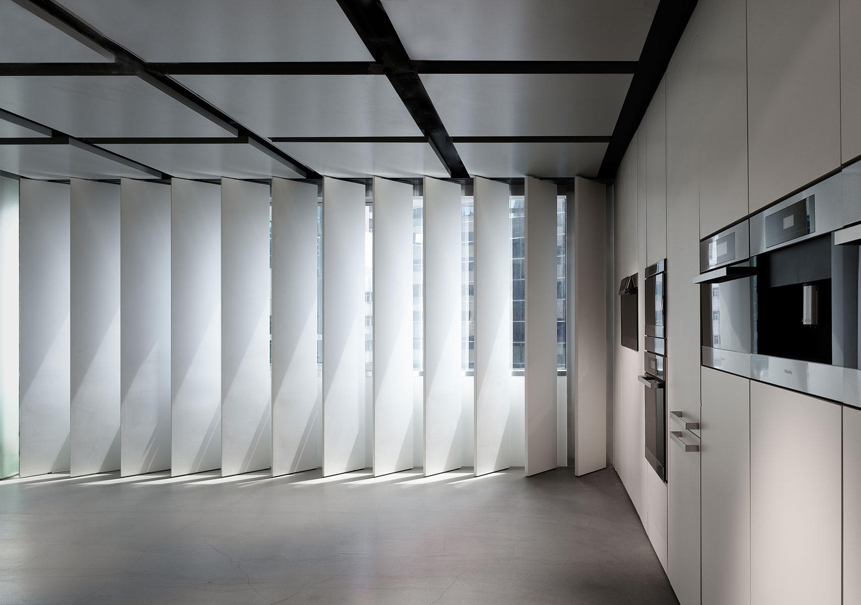
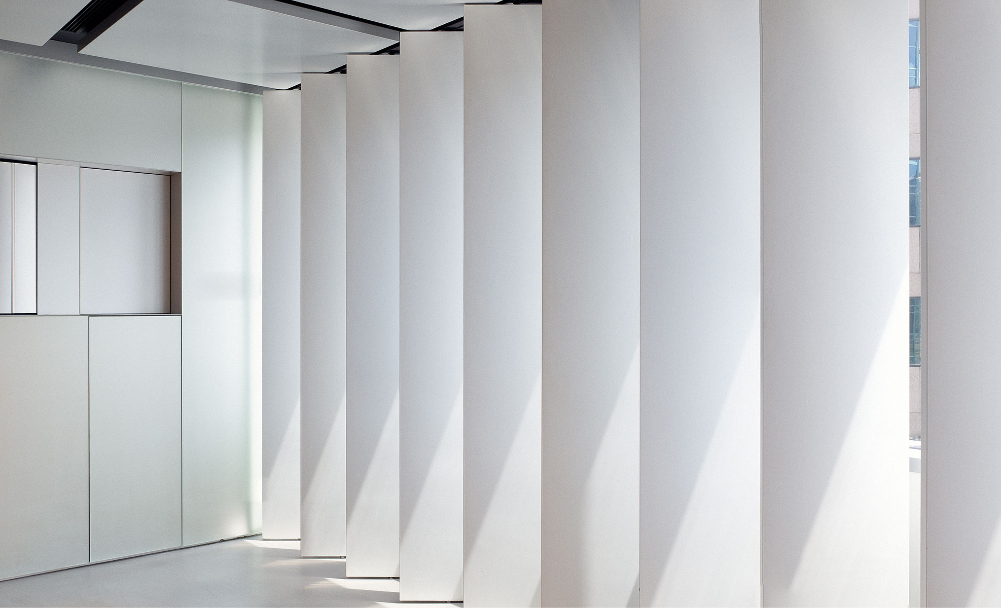
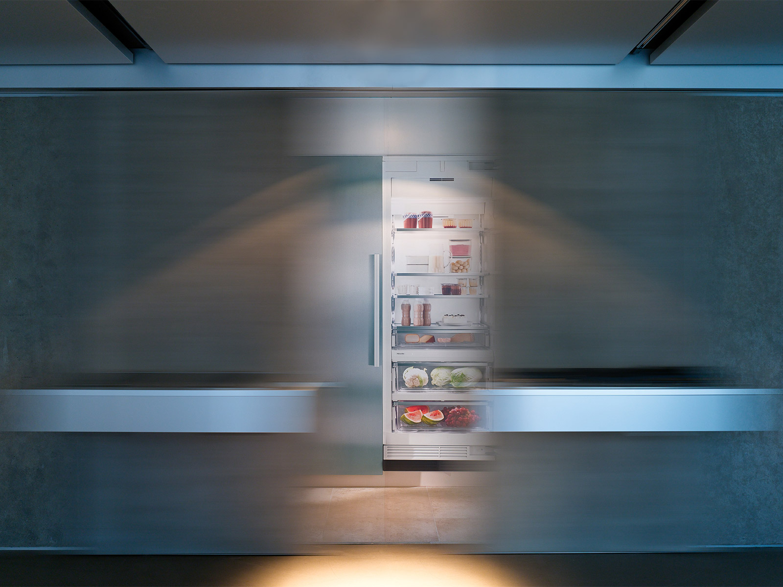
The white demonstration wall, with the product storeroom behind it, is designed so that, depending on a client’s needs, appliances can be rearranged rapidly. Another original approach to product presentation is the way products such as cooking range tops can be mounted on ‘trays’ built into French-plastered sliding doors which open electrically to reveal visuals of Miele’s latest innovations.
