EATING IN TWO
DIFFERENT AMBIENCES
Reach Restaurant, Hong Kong
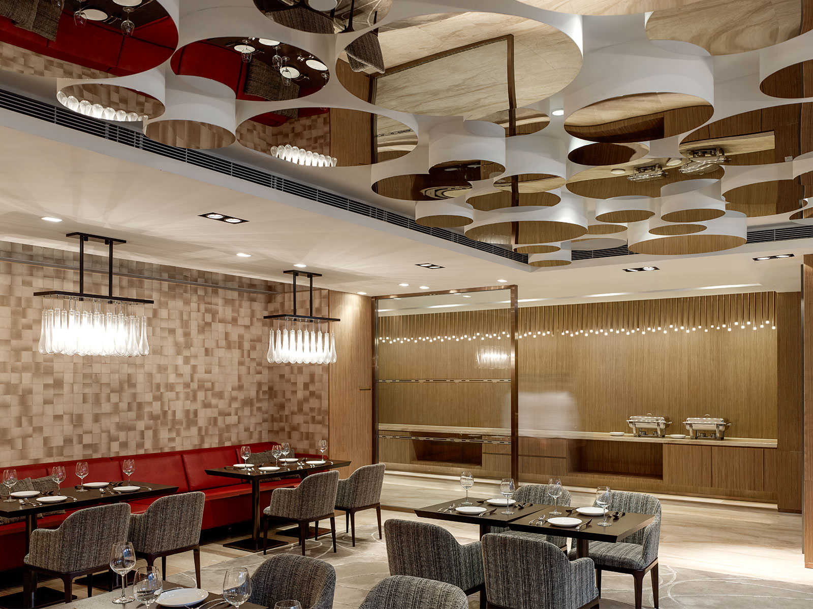
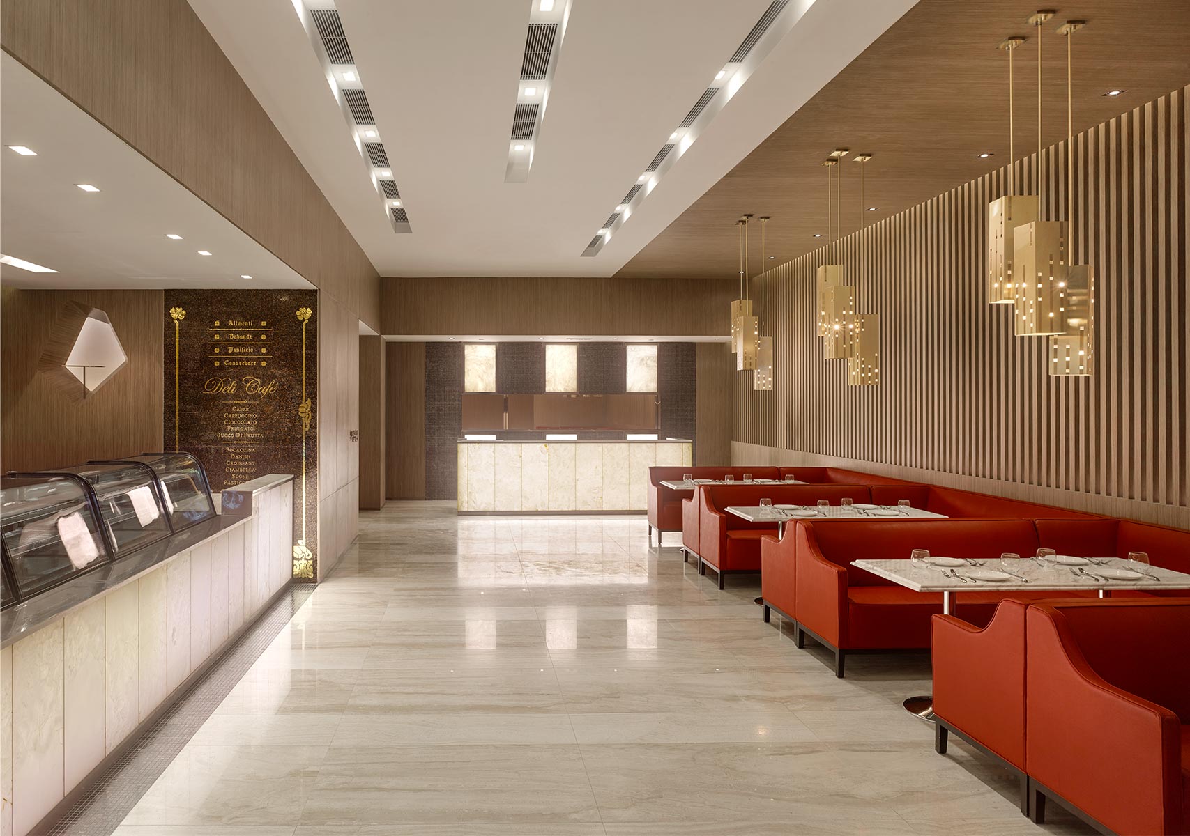
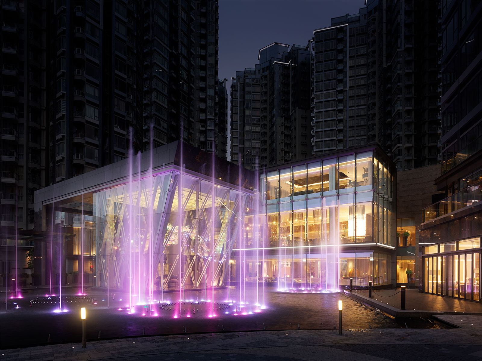
The Club Reach is a gathering place for many hundreds of residents in the associated high rises around it. Antony Chan realised the significance of the diversity of the residents and designed the Club’s two linked ground floor restaurants quite differently – one to suit a Deli Café for those who wanted a relatively straightforward eating experience, and a larger, visually eclectic dining room with the buzzy atmosphere of a French or Italian brasserie.
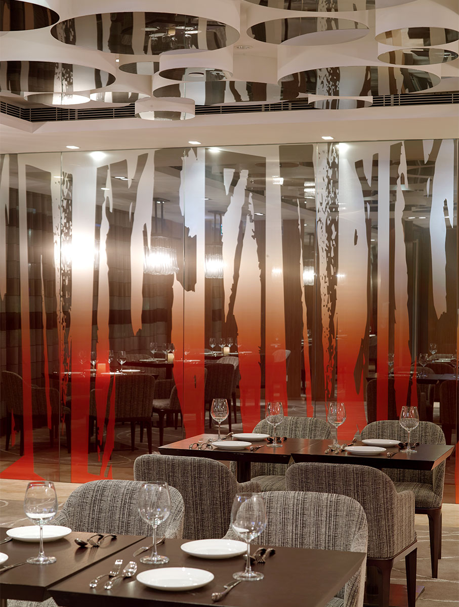
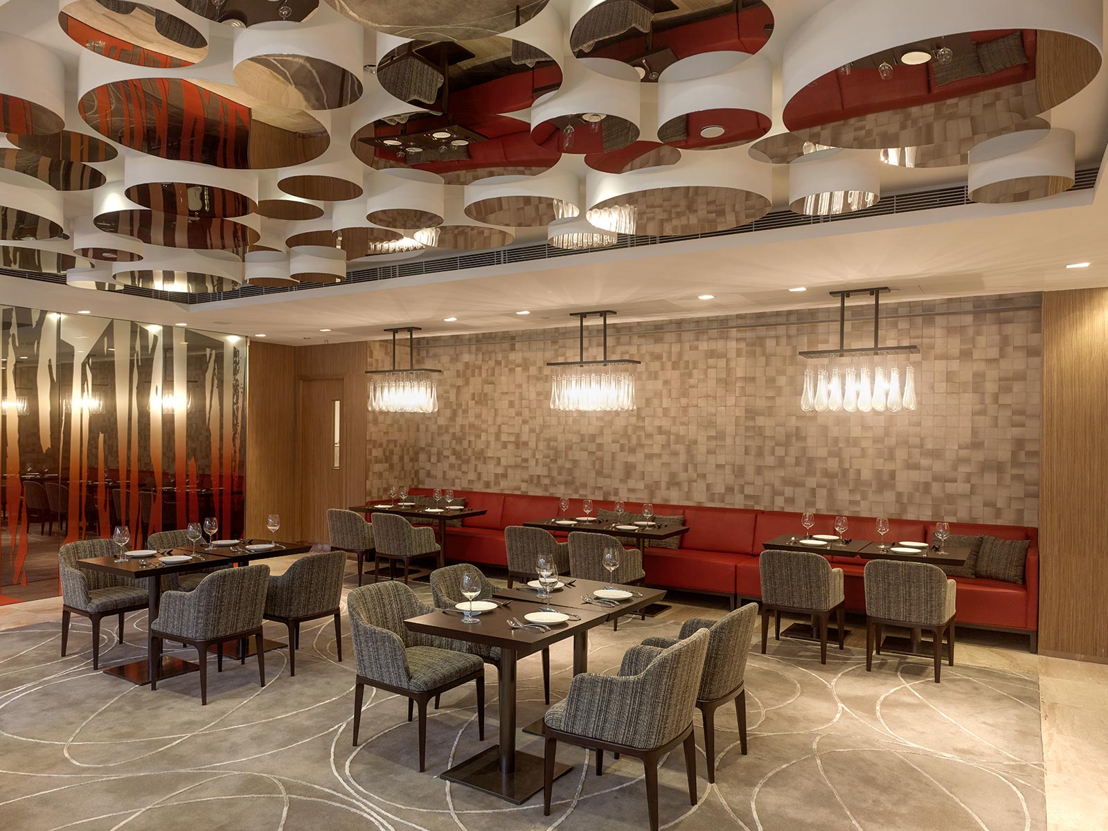
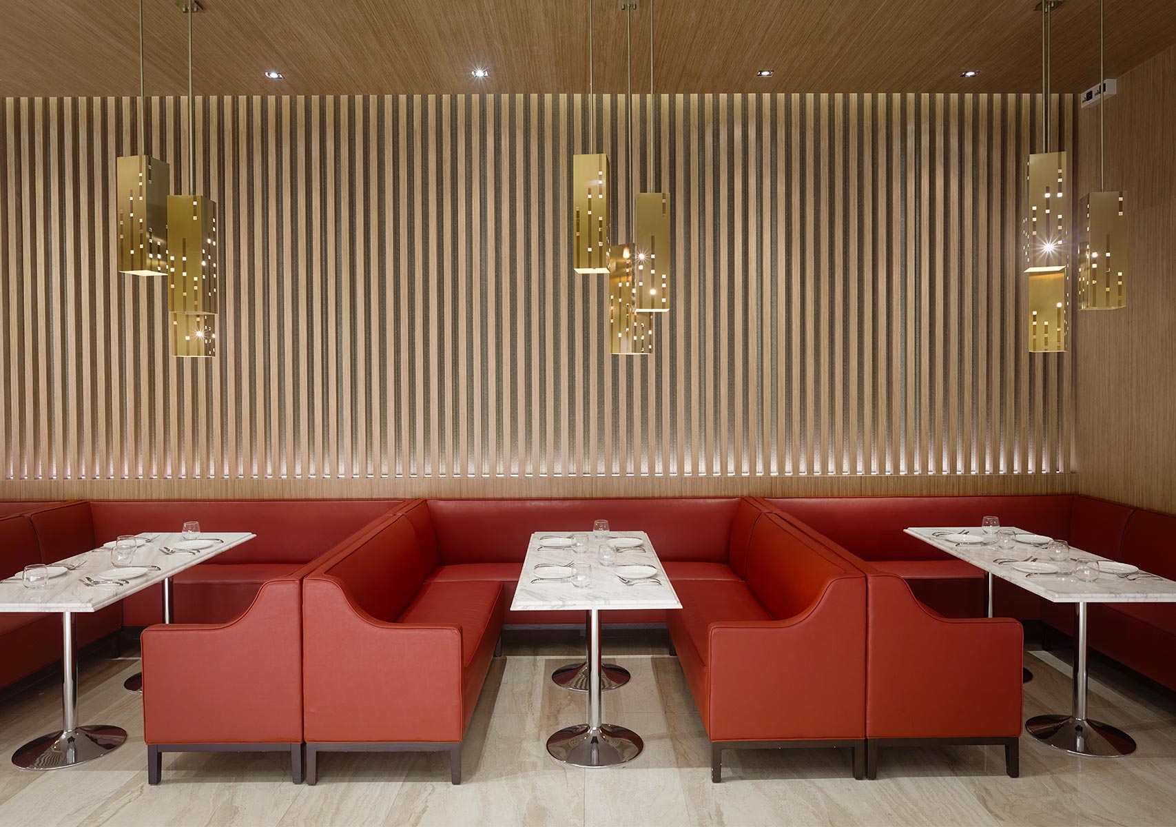
The two design strategies shared only one thing: the colour red on certain features. The design of the Deli Café draws on classic modern Japanese and Italian precedents and features the graphic punch of red-upholstered dining booths, and the onyx-fronted reception desk for the larger restaurant. In the brasserie restaurant, the contrasting features, furniture, and materials are visually engrossing: a long red banquette, a carpet with a meandering line-pattern, richly textured chair upholstery, and a dramatic mirror-wall etched with an abstract forest artwork – ‘a mind-cleanser’ as Antony Chan describes it. The asymmetric cluster of mirrored drums on the ceiling absorb sound and scatter reflections of the restaurant and diners.
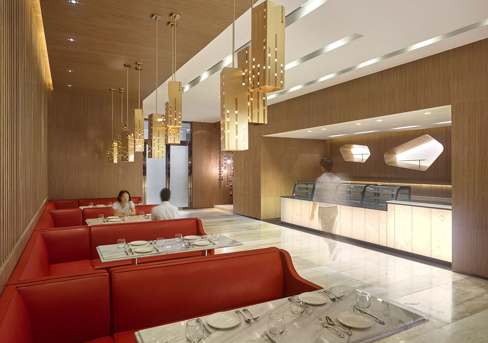
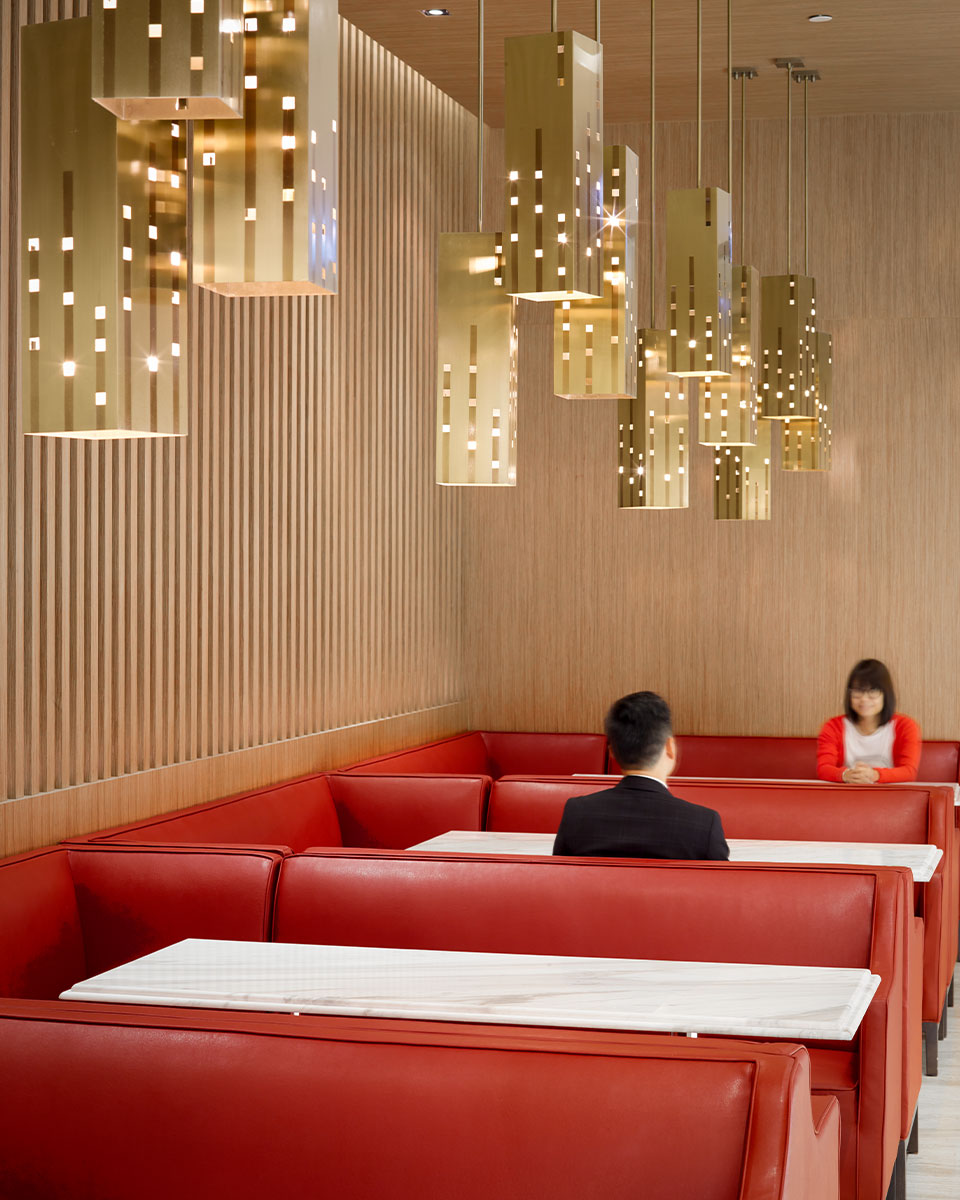
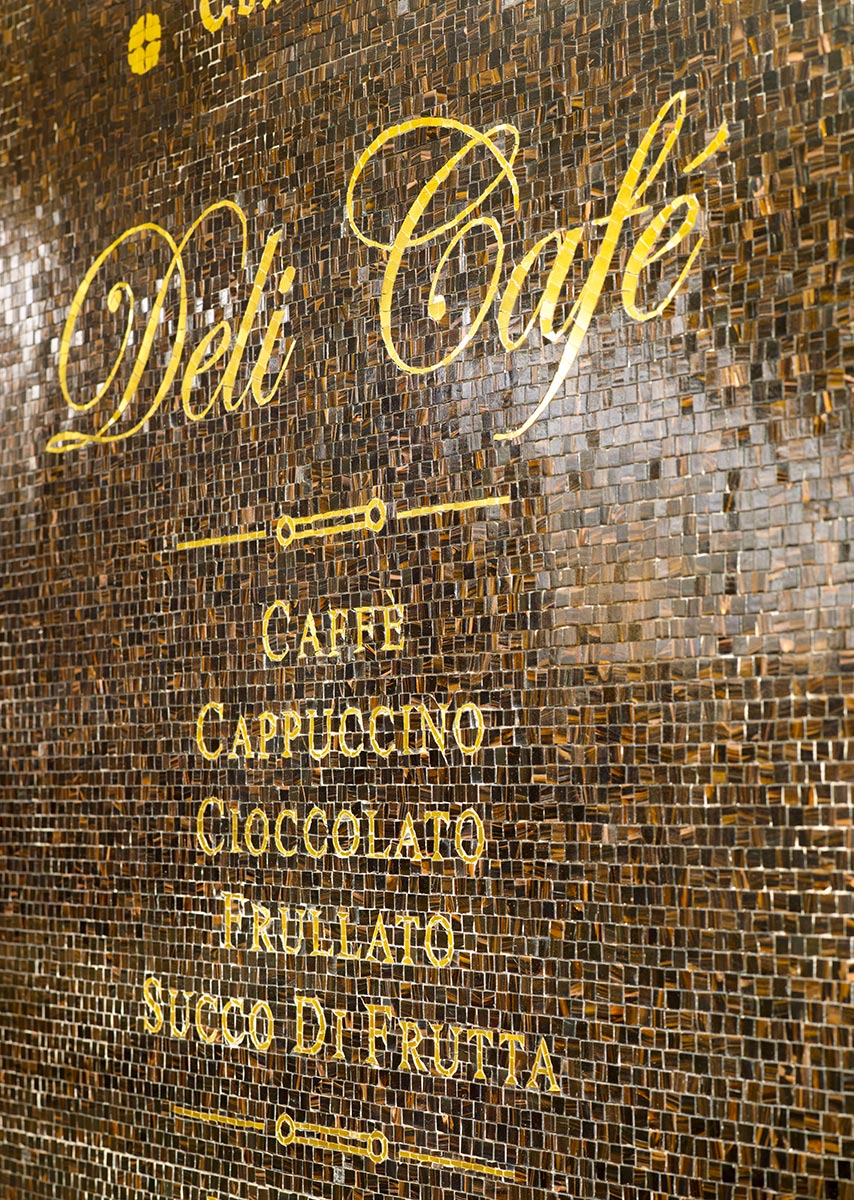
The key characteristic of the design of the Deli Café is that it is clean-lined, which means that the detailing had to be absolutely right, and very carefully crafted. This is particularly obvious in the workmanship of the wooden-slatted wall and its precisely lit bottom and top edges. The gold Deli Café logo is equally important, and has been painted on deliberately textured tiling whose rich visual and tactile qualities add a more historically traditional nuance to the interior.
